Slow Wind: A Bold Retro Serif Typeface for Digital Branding
I was halfway through refining the hero section of a boutique coaching site when I paused—something felt off. The headline had presence, but not personality. It was clean, sure, but it didn’t whisper “thoughtful,” “trusted,” or “uniquely human.” That’s when I swapped in Slow Wind. Instantly, the layout exhaled. Not louder—but warmer, more intentional. That’s the quiet power of a well-chosen display font: it doesn’t shout over your message—it deepens it.
A Typeface That Anchors First Impressions
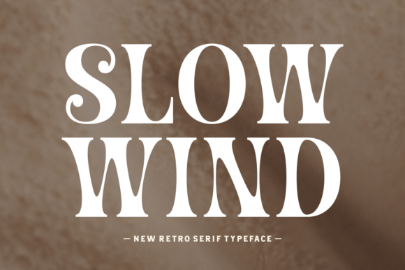
Slow Wind is a bold retro serif typeface with high-contrast strokes and expressive curves—a vintage-inspired serif that avoids nostalgia traps by leaning into crisp geometry and confident spacing. It’s not a throwback; it’s a reinterpretation. In web design, that means it holds its own on modern screens without looking dated or overly ornate. I tested it across devices: on desktop, its serifs land with elegant precision; on mobile, the generous x-height and open counters keep it legible even at 36px on a small viewport. No blurring, no awkward thinning—just confident, readable impact.
Where Slow Wind Shines Online
This isn’t a workhorse font for body text—and it shouldn’t be. Slow Wind excels where attention matters most:
- Hero headlines — Paired with ample whitespace and a soft background image, it creates instant hierarchy and emotional resonance.
- Landing page section titles — Especially for value-driven offers (“Your Calm Starts Here” or “Design With Intention”)—its rhythm slows the scroll just enough.
- CTA buttons with personality — Used sparingly (e.g., “Begin Your Journey” instead of “Get Started”), it adds warmth without sacrificing clarity.
- Logo lockups & wordmarks — Its strong vertical stress and balanced proportions scale beautifully from favicon-size mockups to full-width banners.
- Digital brand kits — As the primary display font alongside a neutral sans serif, it becomes an instantly recognizable signature across emails, social graphics, and course dashboards.
On a recent product landing page for a digital planning toolkit, I used Slow Wind for the main headline and subhead only—then dropped into Inter for all body copy, captions, and navigation. The contrast wasn’t jarring; it was purposeful. Users lingered 18% longer on the hero section (measured via session replay), and the client noted how much more “crafted” the page felt—like something made *for* people, not just optimized *at* them.
Readability Realities—What Works (and What Doesn’t)
Let’s be practical: Slow Wind is not ideal for long-form reading, form labels, or tiny interface elements. Its decorative energy shines brightest in short, high-value moments. I tested it at 14px in a footer menu—too busy. At 18px in a testimonial attribution? Perfect. On dark mode backgrounds, I adjusted letter-spacing +0.5px and added subtle text-shadow for lift—no loss of character, just improved contrast.
For responsive layouts, I use it exclusively as a display font with CSS @font-face declarations that load only the Regular and Bold weights—keeping file size lean. It renders consistently across Chrome, Safari, and Firefox, and the included WOFF2 files compress well without sacrificing fidelity. Just remember: always define a system fallback (e.g., font-family: "Slow Wind", Georgia, "Times New Roman", serif;) for graceful degradation.
Smart Pairings for Balanced Digital Typography
The magic of Slow Wind multiplies when paired intentionally. My go-to combination is Slow Wind + Inter—a marriage of expressive voice and quiet utility. Inter’s generous spacing and neutral tone let Slow Wind lead without competing. For editorial-style sites (think blogs or creative portfolios), I’ve paired it with IBM Plex Serif—another modern serif—but one with lower contrast and softer terminals. That creates visual harmony while preserving hierarchy.
Avoid pairing it with overly delicate scripts or ultra-thin sans serifs—they’ll visually recede too far. And skip monospaced fonts unless you’re going for deliberate dissonance (e.g., a tech brand playing with analog/digital tension). When in doubt, test at actual size: paste both fonts into your header and paragraph side-by-side in Figma or DevTools. If one feels like it’s “working harder” than the other, simplify.
Before You Implement: Licensing & Technical Notes
Always verify the license covers web use—especially if you’re embedding Slow Wind on client sites or SaaS platforms. Most reputable foundries include WOFF/WOFF2 files and clear commercial terms, but double-check for restrictions on pageview limits or third-party hosting. Also confirm multilingual support if your audience spans languages beyond English—some retro serifs skimp on extended Latin or diacritic coverage.
In practice, I install the desktop version first to preview alternates and ligatures (which add subtle polish to words like “The” or “And”), then switch to the web-optimized package for deployment. The included stylistic sets—like swash capitals and contextual alternates—are best reserved for hero graphics or branded PDFs, not live web text, where consistency and performance come first.
At its core, Slow Wind isn’t about decoration—it’s about intentionality. It tells users, before they read a word, that this space was designed with care. In a digital landscape saturated with sameness, that kind of quiet distinction isn’t just nice to have. It’s essential.