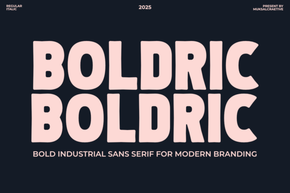
Boldric: A Bold Industrial Sans Serif Font for Digital Impact
It started with a hero section that felt… safe. Too safe. I was polishing the homepage for a ceramicist’s new online shop—clean imagery, thoughtful spacing, strong product photography—and yet the headline just didn’t land. It blended instead of stood out. So I swapped in Boldric. Instantly, the tone shifted: grounded, confident, quietly authoritative. Not loud, but undeniably present. That’s when I knew this wasn’t just another display font—it was a digital design decision with real weight.
What Boldric Brings to the Screen
Boldric is a bold industrial sans serif font rooted in vintage signage and mid-century poster typography—but it’s not nostalgic for nostalgia’s sake. Its letterforms are tightly engineered: generous x-height, open counters, sturdy terminals, and subtle geometric tension. There’s no excess flourish—just clarity, structure, and quiet strength. On screen, it reads like a promise: intentional, trustworthy, human-made. As a web designer, I’ve tested dozens of “bold” fonts that sacrifice legibility for impact. Boldric doesn’t ask you to choose. It delivers both.
Hero Headlines & Landing Page Presence
I dropped Boldric into three distinct landing contexts: a coaching website’s value-prop banner, a small-batch skincare brand’s product launch page, and a portfolio site’s featured project header. In each case, it anchored the layout without competing with imagery or UI elements. Its generous letter spacing (even at default settings) kept headlines airy on desktop and surprisingly resilient on mobile—no crowding, no awkward line breaks. At 48px on desktop and 32px on mobile (with appropriate line-height), it maintained hierarchy and scannability. Bonus: it pairs beautifully with image overlays. Over a muted background photo? Crisp. Over a textured gradient? Still legible. No stroke needed, no shadow required.
Where Boldric Shines—and Where to Pause
Boldric excels where attention matters most: hero titles, section headers, CTA buttons, logo lockups, and campaign banners. Its bold weight commands focus without shouting; its industrial character adds authenticity to artisanal, creative, or purpose-driven brands. I used it for a “Limited Drop” badge on an e-commerce site—and yes, it made scarcity feel tangible.
But let’s be practical: Boldric isn’t built for body copy. Its personality is too strong for paragraphs. I tested it at 16px for a blog intro—and while readable, it fatigued the eye faster than a neutral sans serif. Likewise, avoid it for navigation menus, form labels, or dense dashboard interfaces. It’s a display font first: best deployed where brevity meets intention.
For accessibility and performance, I confirmed Boldric includes clean WOFF2 files, supports Latin-1 and basic multilingual characters (great for bilingual small business sites), and offers at least one solid weight (Bold) plus alternates—some with tighter spacing for tighter layouts. Always check licensing before deploying on client sites or SaaS platforms; commercial use rights matter, especially for subscription-based or white-labeled products.
Smart Pairings for Balanced Digital Typography
The magic of Boldric reveals itself most clearly in contrast. Paired with a warm, highly legible sans serif like Inter, Poppins, or even system fonts (San Francisco, Segoe UI), it creates instant visual rhythm: Boldric sets the tone, the companion font carries the conversation. For a more editorial or elevated feel—say, a writer’s portfolio or a boutique consultancy—I paired Boldric headers with a restrained serif like Lora or Playfair Display. The juxtaposition feels intentional, not accidental.
Avoid pairing Boldric with overly decorative scripts or thin handwritten fonts—they’ll visually recede or clash. Save those for accents (a single word in a testimonial, maybe), not structural typography. And while Boldric works beautifully as a standalone logo font (I tested it in SVG at multiple sizes), always export fallbacks for environments where webfonts may delay or fail.
Real-World Readability Across Devices
I stress-tested Boldric across real conditions—not just ideal Chrome on Mac, but Safari on iOS, Chrome on Android, and even legacy Edge. At headline sizes, it rendered cleanly everywhere. On dark mode interfaces, it held contrast without washing out (especially with a slight text-shadow on very dark backgrounds). For buttons, I found 18–20px optimal—large enough to tap comfortably on mobile, bold enough to signal action.
One note on cutting-edge layouts: Boldric performs well in CSS Grid and Flexbox containers, but avoid extreme letter-spacing values (< 0.5px) on smaller screens—tracking can collapse unpredictably. Stick to relative units (em, rem) for scalability, and always preview in responsive mode before handoff.
More Than a Font—A Design Decision
Using Boldric didn’t just change how a headline looked. It changed how the whole page *felt*: more deliberate, more tactile, more human. In a landscape of sleek-but-soulless UIs, Boldric introduces warmth through structure—not ornamentation. It signals craftsmanship without pretension. Whether you’re launching a course, refining a portfolio, or building a brand kit for a client, Boldric isn’t just typography. It’s a quiet statement of confidence—one pixel, one letter, one headline at a time.